The Logo
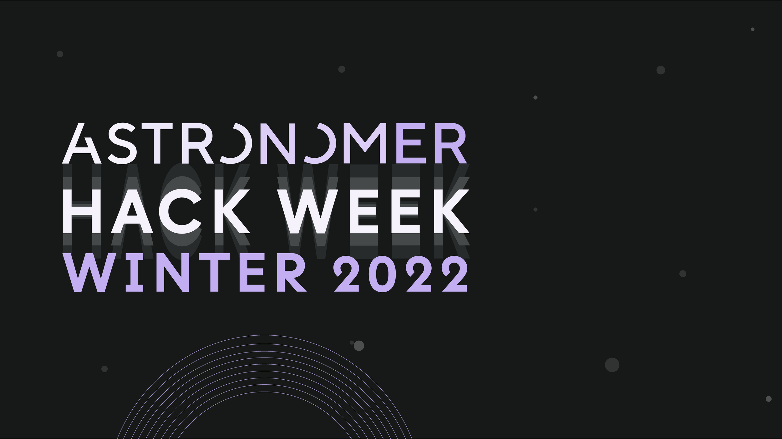
Since there is intention to host two Hack Weeks, one in the winter and one in the summer it made sense to use a cool color for the winter so we could reserve using the Astronomer orange in the summer time. Originally I tried this logo in blue but it felt too similar to Astro Days.
Like other event logos, it is a made of the Astronomer brand font, I intentionally made sure the highest point of contrast were the words of Hack Week, I used two tones of shadow to bring the eye to almost zoom in on the words. While the words Winter 2022 match the darkest part of the Astronomer logo so everything is cohesive.
Hack Week Awards
Below are the designs for each Hack Week Award category.


